 Blog
Blog Links
Links Contact
 About
AboutMinor improvements and tweaks to my KDE Plasma desktop
Publish Date: 2026-07-20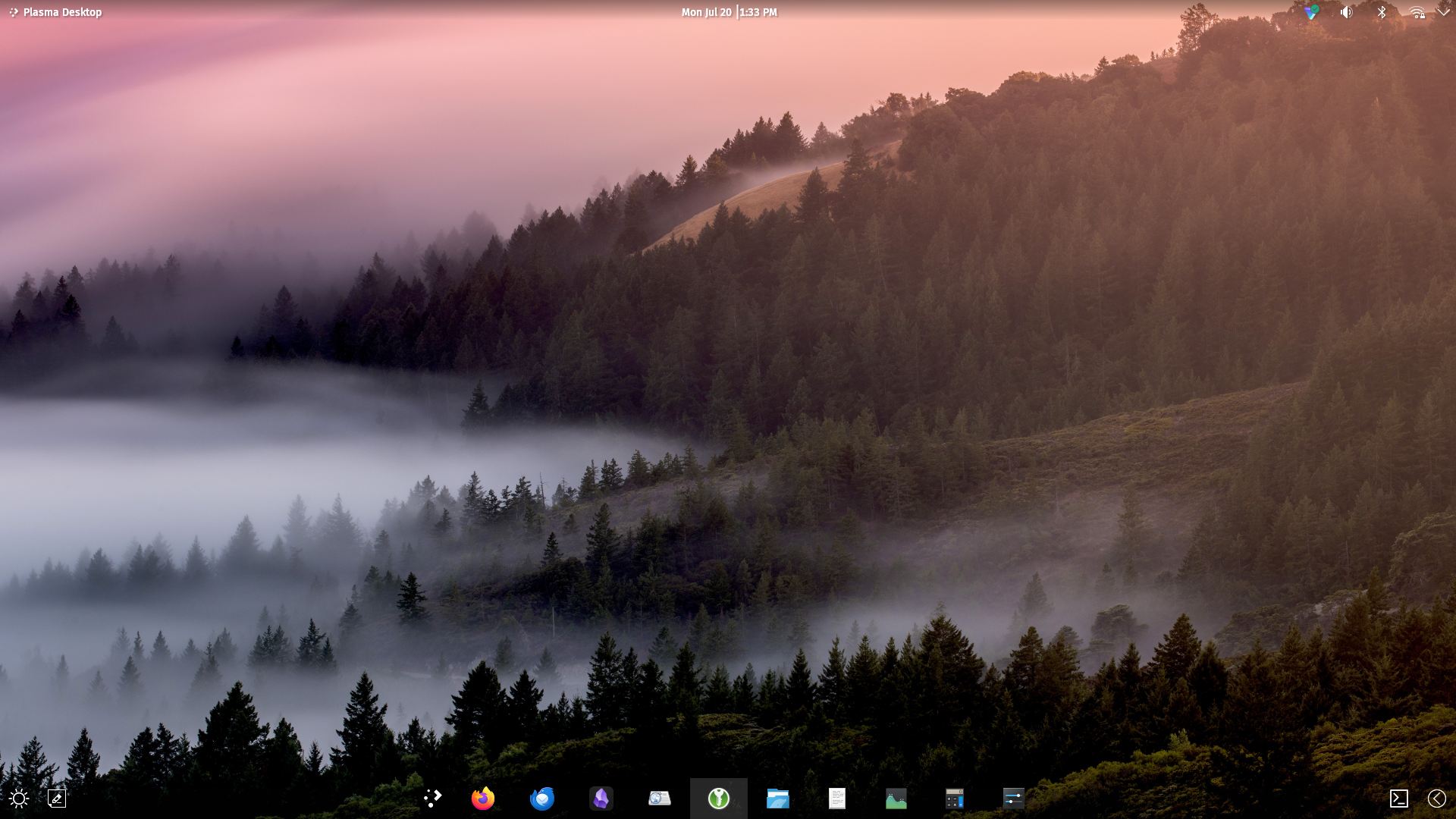
This blog post is in relation to my previous post on "Guide to a modern and practical desktop with KDE Plasma 6 (X11 only)." I'm still using this desktop setup, but with a few additional improvements and tweaks to make it more pleasantly functional.
I'd like to start off by saying that the floating panel feature of KDE Plasma is not so great. I've been toying around with it and have noticed that even without the panel plugins, it's not a smooth operation for application menu bar users when transitioning states. Even on Wayland, it has this frame hitching effect that's very jarring. For instance, the floating panel changes the internal margins. This can cause some of the widgets and icons to subtly reposition between floating and non-floating states, which in my opinion becomes a usability flaw if your icons are moving around like that.
I've also removed the virtual desktop viewer widget since I found it to be a waste of space. When I swipe my touchpad, I can easily tell which desktop I'm on and don't need the widget at all.
And I also moved the window controls to the left rather than them being on the right hand side. It has a more visual consistency being alongside the application menu rather than it being on the right-hand side next to the system tray. Additionally, I've configured it to always remain visible rather than dynamically winking in and out depending on the window state, because I thought it kind of annoying that the window controls weren't consistently there. I found myself resorting to those more often than the same set of controls in the actual window titlebars themselves.
Theme-wise, I've also made my own panel colorizer presets to make the desktop feel a little more opened up and less constrained by panelbars. When an application window becomes maximized or touches a panel, it'll change to a solid bar that blurs the background, which I think looks quite nice.
Would look nicer if it faded between transitions.
More images of the desktop:
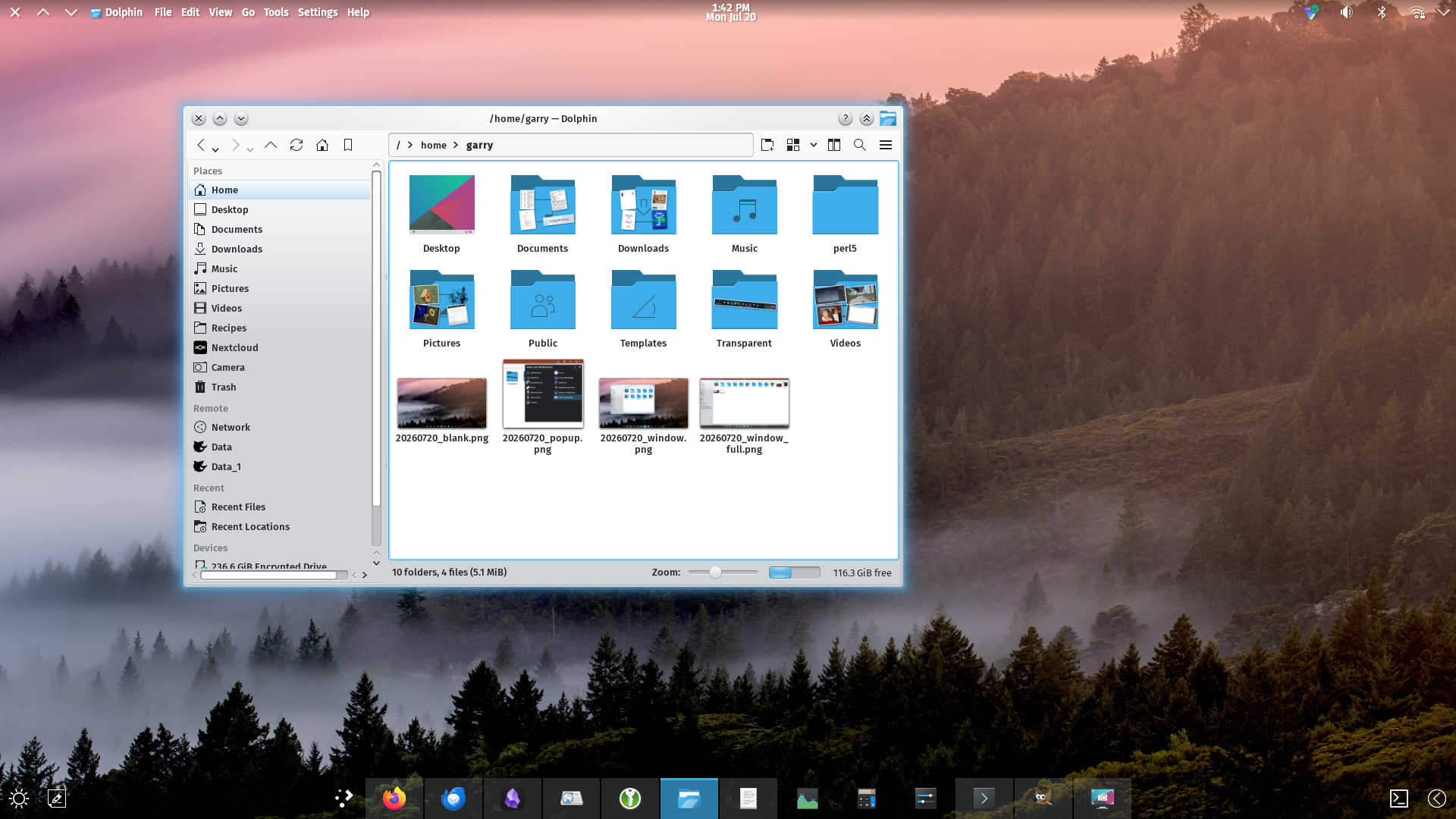
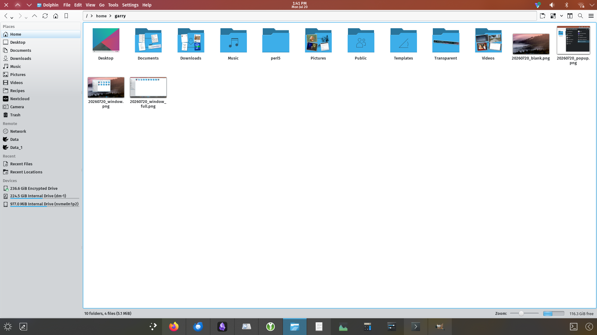
This really looks and feels to me like something KDE Plasma or some desktop environment project aught to copy because it works really well. Visually it looks nice and made for productivity rather than an art project or something straight out of the early 2000's, albeit the Breeze Plasma shell theme is lacking (especially among the widget themeing.)
For example, this bubbly pop out island effect doesn't communicate connectivity with the rest of the desktop shell, even though it's part of it; this makes it feel sort of thrown out there and in-cohesive, as if it were alienated from the rest of the UI. It would look a lot nicer with a frosted glass effect too, but after experimenting with other Plasma shell themes, none of them are as complete as the default Breeze theme, so I'm going to leave it alone for now.
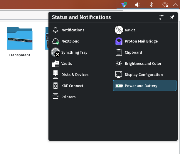
Pop outs like this aren't very good form. It should be connected to the panel.
Thanks for reading my blog!
[Back to top]
Comments: